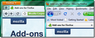
Firefox 4 UI has some major changes in App Button. The new button is set to replace the menu toolbar that Firefox users are accustomed to. You can see just how much space the new layout saves when compared to Firefox 3.5.
App Button : An App Button which is similar to the single menu approach taken by Windows 7 native applications (Paint, WordPad) and by MS Office.
The UX team feels this approach has several advantages over the previous idea:
- It is less complex
- Takes up less space
- Instead of two potentially conflicting locations for menu items, there is now only one unified location
- Can be placed in the upper left analogous to the Menubar paradigm it is replacing
- Similar to the far more ubiquitous Office 2007/2010 + Windows 7 application menu
- Reduces clutter on the Navigation Toolbar
- It also creates a more flexible and rich canvas for perhaps doing some decidedly non-menu-esque things
One of the benefits of the App Button is that it is similar to the way Microsoft is treating its native apps and Office. Another benefit is that the placement is closer to where the Menubar would be and therefore it is more familiar.These UI changes are scheduled for Firefox 4.0 only, and will not make it in time for 3.7. And as Recently Firefox predicted FF4.0 may be delayed upto 2011, i am sure inspite of these attractive features it would be out of race.


